Pinetop Distillery
A North Carolina spirits brand, from the mountains to the coast.
Pinetop Distillery
Craft distillery, Raleigh, NC
Brand identity, guidelines, packaging, merchandise and campaign concept
Not a crowd. A feeling.
Pinetop is a local craft distiller. Gin is where its heart lives, and North Carolina is a close second.
The founders first pictured their drinker as themselves: finance guys who go camping on the weekend.
An audience that was too small.
The brand didn’t exist yet, and the audience it was aimed at was too small. The real drinker was anyone who wanted to feel North Carolina in a glass: to hear the mountains and feel sand between their toes.
Mountains to the sea.
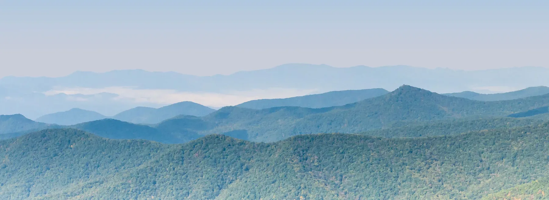
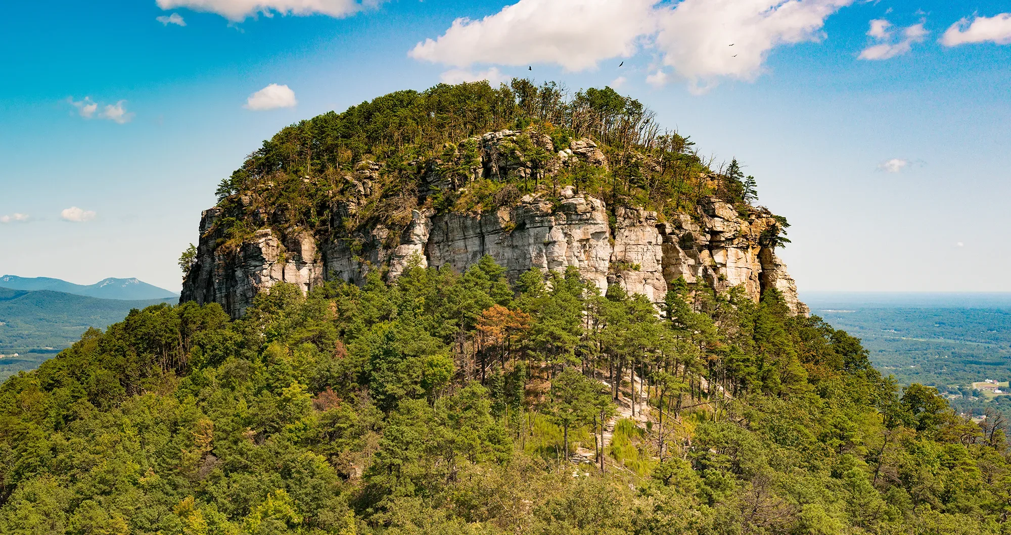
We aligned on a feeling with two ends. In the west, pine, mist and woodsmoke on the Blue Ridge. In the east, dunes, piers and salt air on the coast.
The brand had to carry you from one to the other. Wordmark and illustration studies worked it out before the system settled.
Etched in bark, soaked in mist.
I wanted the brand to look weathered into place. A slab serif and whiskey-label details borrowed from 19th-century Appalachia, hand-drawn elements instead of clean automation, and a palette of earth and sky: tobacco, coral and pine, navy and sky blue, grounded by charcoal and cream.
Southern signage gave it a vocabulary people already knew. Worn edges and sanded textures kept it from feeling like a costume. A trail-map contour texture and a full brand standards guide let the system run on its own.
Pour a little. See a little more.
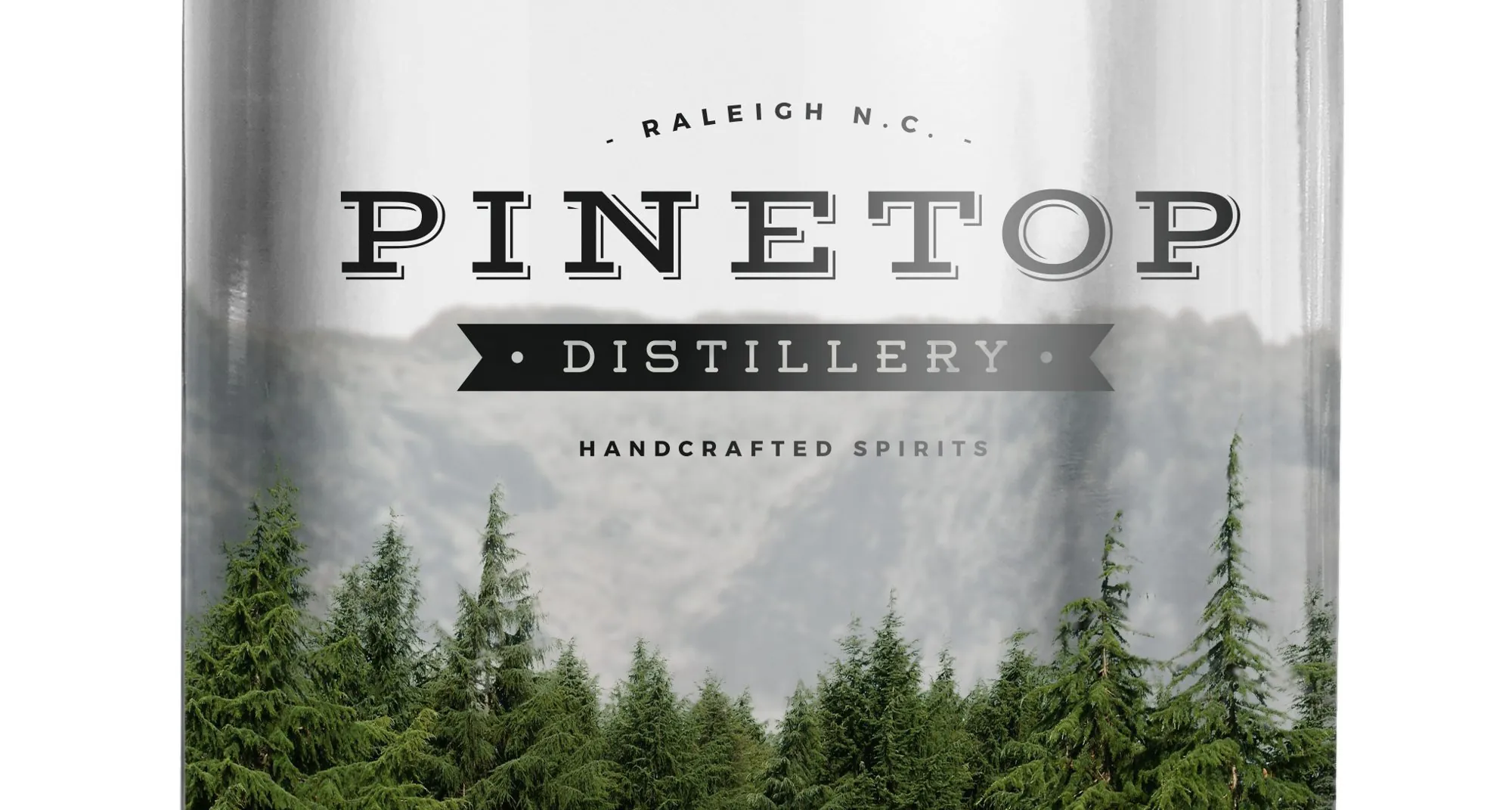
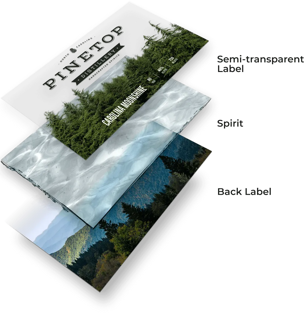
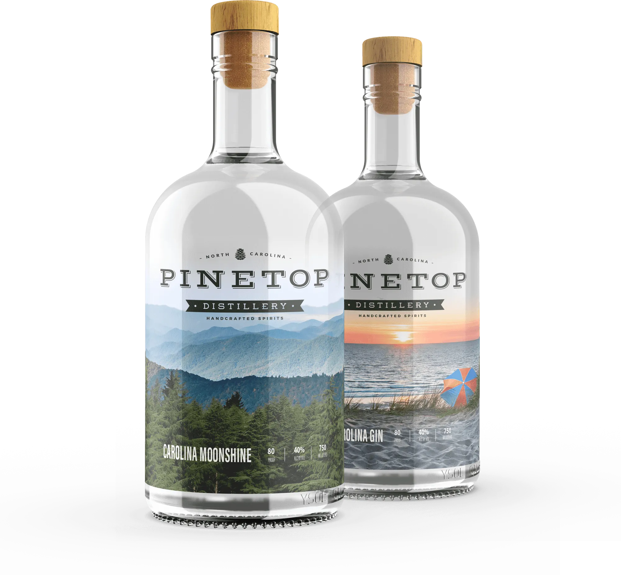
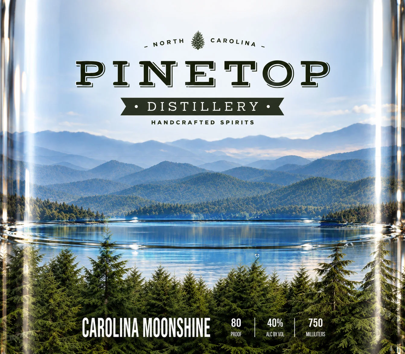
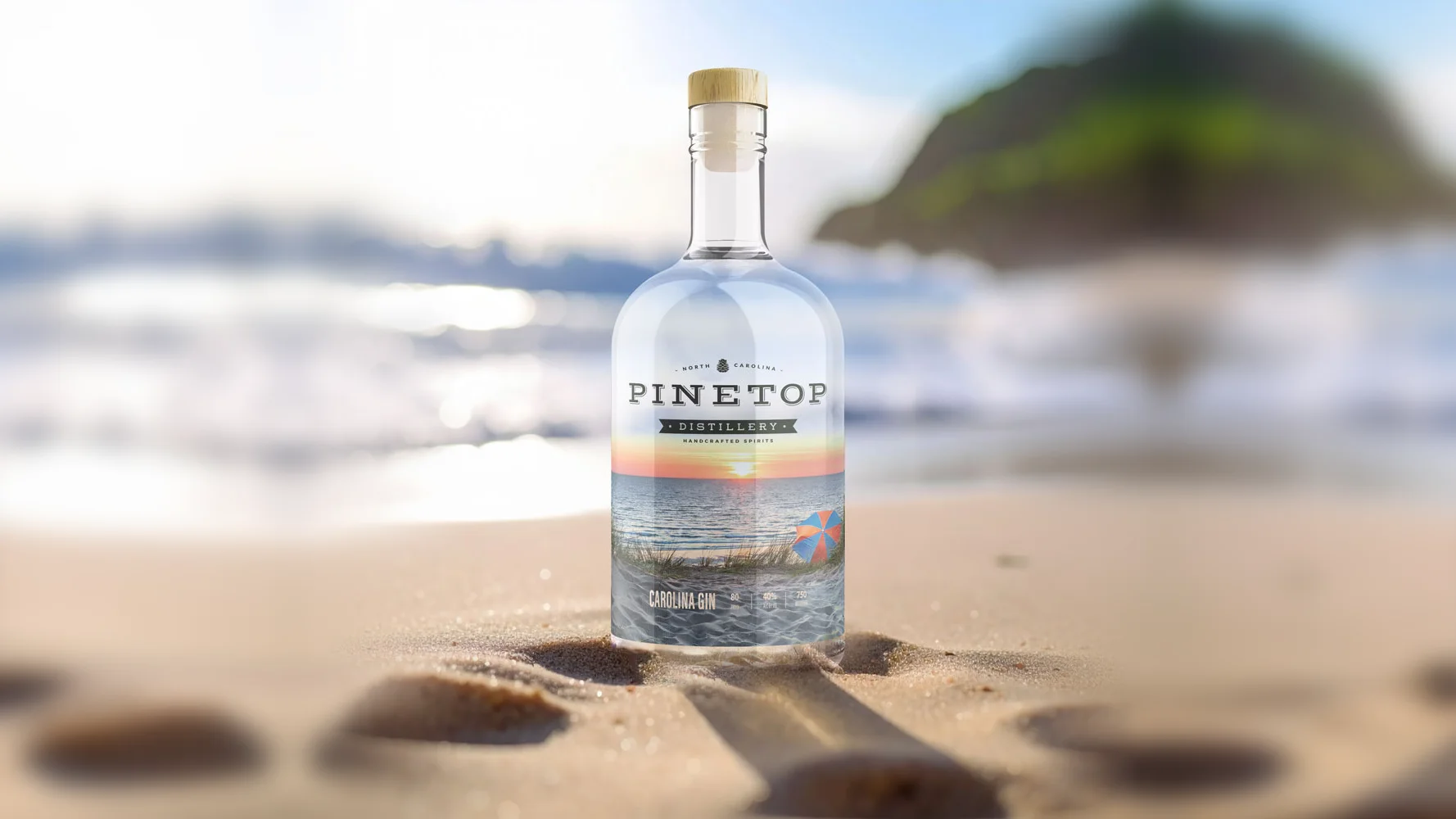
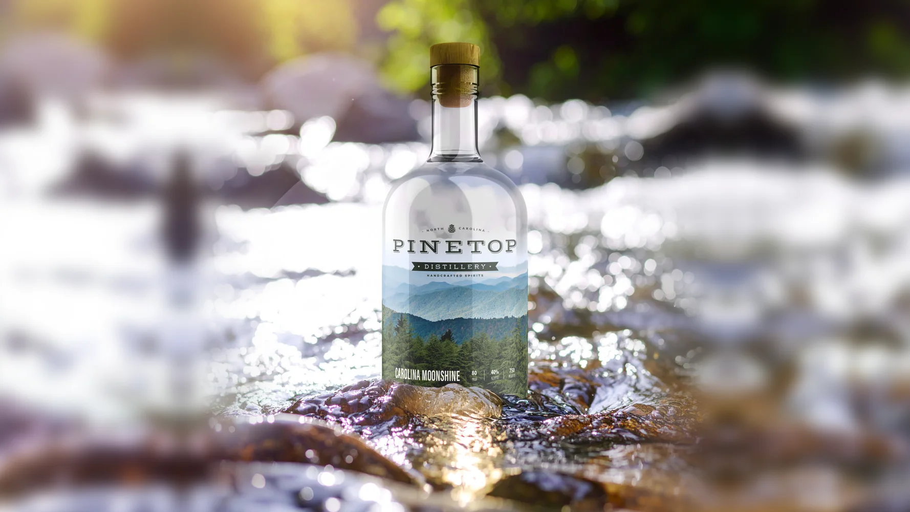
Each bottle wears two labels. The clear front carries the logo and a stand of pines; the back carries the far view. As the level falls, the view opens up: a mountain lake through the Carolina Moonshine, the ocean through the Carolina Gin. One label system keeps the line reading as one brand on a crowded shelf.
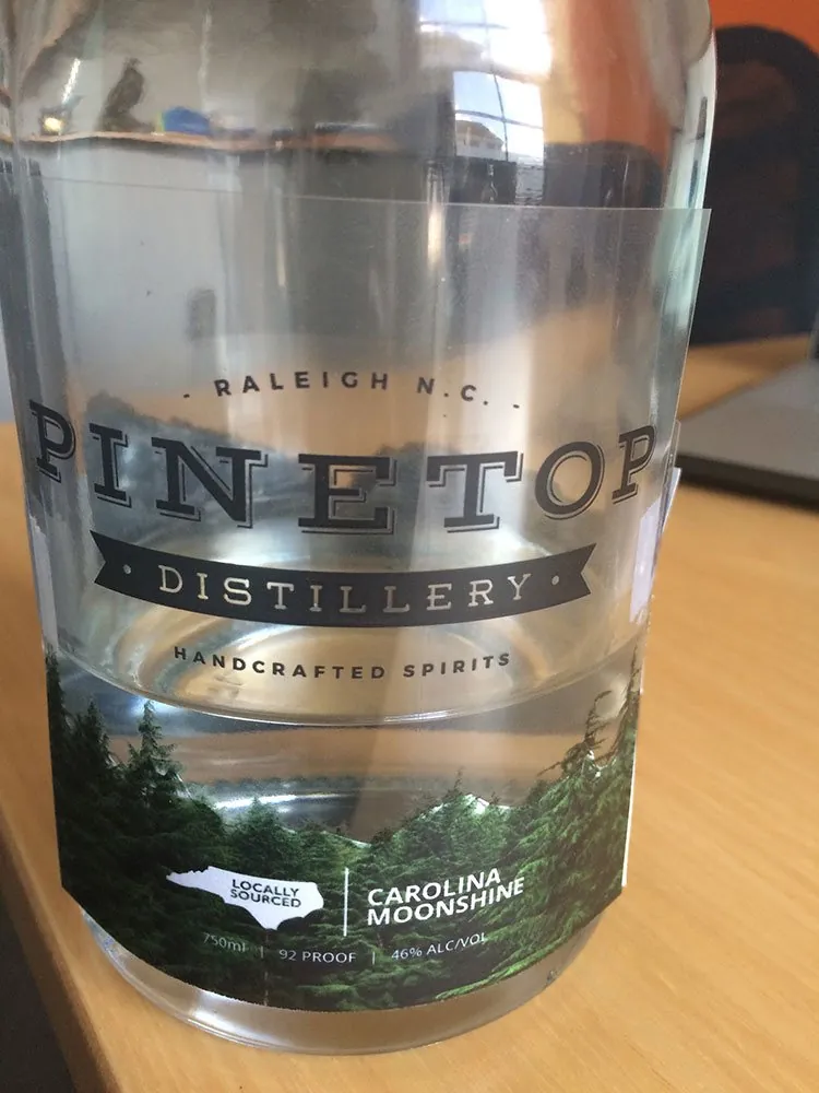
Before anything went to a printer, I printed the labels and wrapped real bottles to prove the reveal worked through glass and spirit.
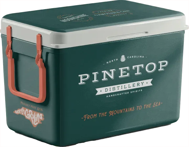
The Pinetop Passage, a statewide campaign concept, takes the brand on the road in a custom truck from Asheville to Wilmington, with a trail passport, wood-slice coasters as the giveaway and a Pinetop cooler as the prize.
The story kept pouring.
Pinetop launched with a brand that already felt rooted, on a bottle that rewards every pour.
The same story runs from the label to the merch to the campaign concept. Meet Pinetop on a shelf or at a bar, and you’d know it.